
Learn how to easily create responsive applications using Angular and Flex Layout.
Goals
Some goals for my app:
- Use Flex Layout Angular component layout engine.
- Create a responsive
mat-grid-listusing Angular Material. - Not write any Sass or CSS.
Here you can see that I have an mat-grid-list with four mat-grid-tile children, specifying a fixed number of columns to 2:
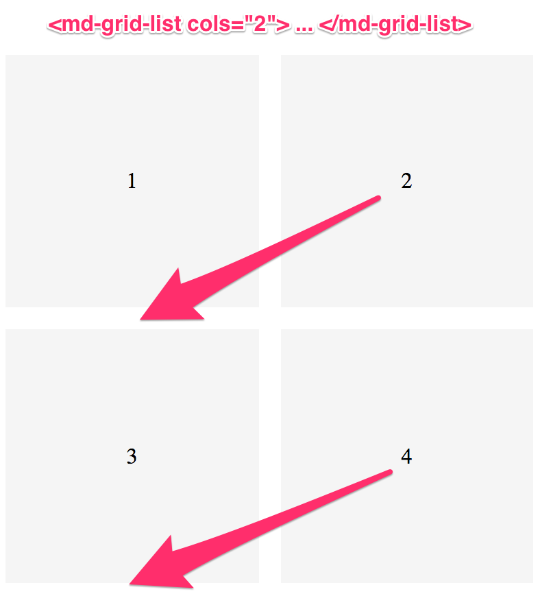
As I indicated I want my design to be responsive in that tiles “2” and “4” will flow down when we hit the extra-small break point (most likely for a mobile device).
The solution is to set the cols input binding to a variable in my component that is determined by the width of the browser.
But, how do I do this?
This is the problem that we are going to solve.
Flex Layout
Our solution: Angular Flex Layout. What is Flex Layout? According to their project details on GitHub:
Angular Flex Layout provides a sophisticated layout API using Flexbox CSS + mediaQuery.
In my opinion:
Angular + Flex Layout = web dev dream
Flex Layout enables us to use flex-based layouts for modern browsers without having to master Flexbox. Sounds too good to be true, right?
Getting Started
The basic directives that you will use most often are fxLayout and fxLayoutAlign.
The fxLayout directive specifies both that our element behaves like a block element and the content uses the flexbox model, as well as the flex direction of the child elements.
The two possible values for the fxLayout directive is either row or column.
The fxLayoutAlign directive specifies the alignment of the child elements, both on the main-axis and the cross-axis.
You can read more about specifics of these directives, as well as additional directives on the API documentation page.
flex-direction: row
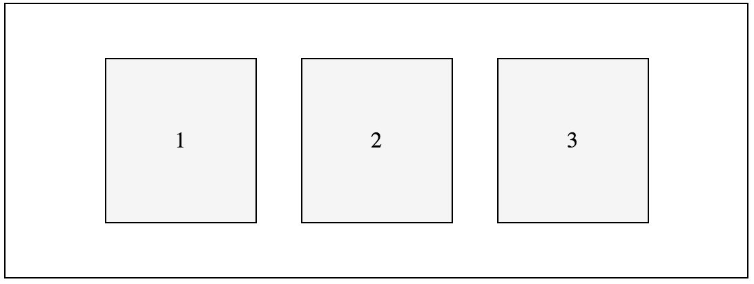
First, let’s look at creating a simple row of elements.
To do this, we will use the fxLayout directive with the row value.
I am also going to use the fxLayoutAlign directive to specify the alignment of the child elements.
In this example I am going to set the main-axis to center and the cross-axis to center
Further, I have set a fixed height on the parent element so we can see how the alignment works.
<div fxLayout="row" fxLayoutAlign="center center" class="row-example">
  <div>1</div>
  <div>2</div>
  <div>3</div>
</div>
Here is how this is displayed in the browser:
Pretty cool, eh?
flex-direction: column
Ok, now that we saw the basics of using fxLayout let’s set the flex-direction to column:
<div fxLayout="column" fxLayoutAlign="center stretch" class="column-example">
  <div>1</div>
  <div>2</div>
  <div>3</div>
</div>
Here is how this is displayed in the browser:
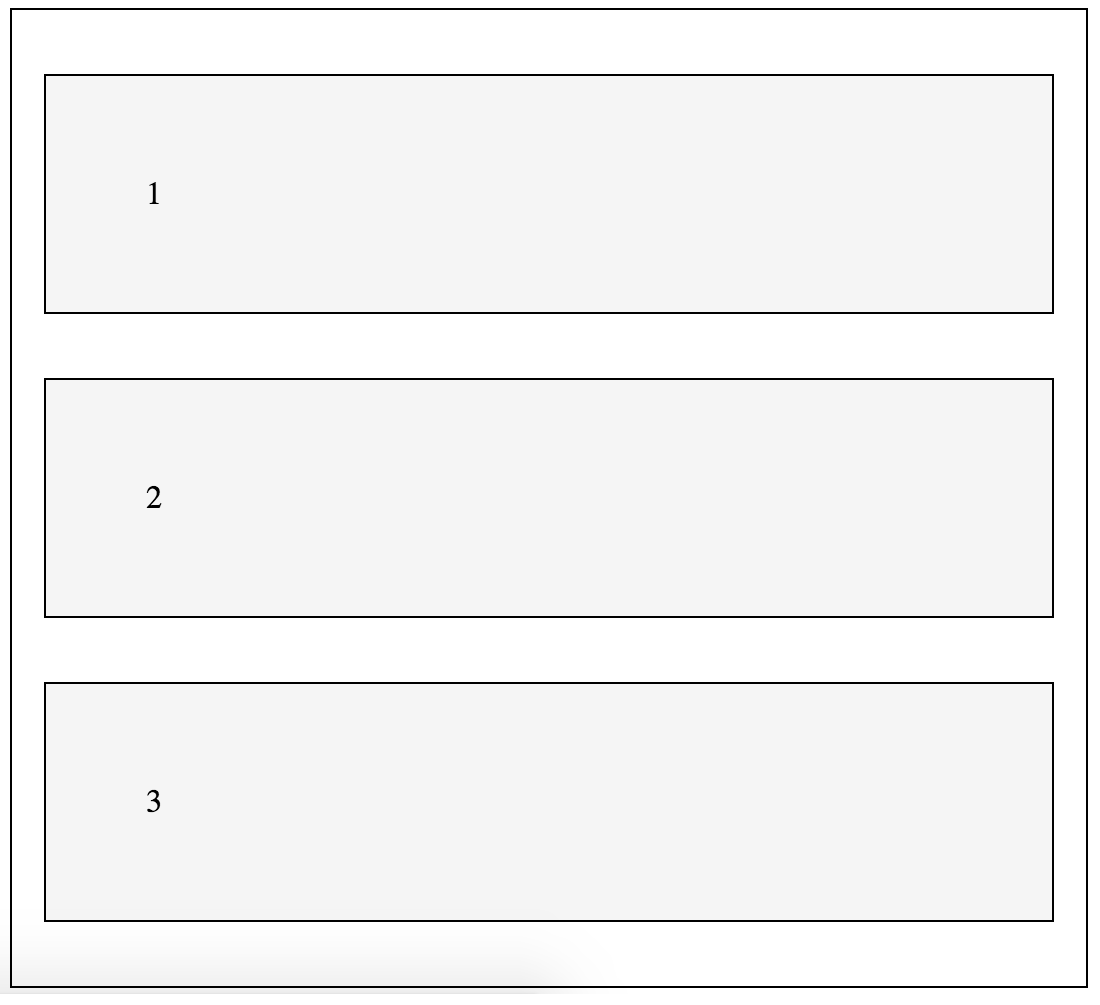
Not much has changed.
First, I updated the fxLayout to column.
Secondly, I changed the fxLayoutAlign cross-axis alignment to stretch.
Check out this simple app to explore the fxLayoutAlign values to get more comfortable with the available values for setting the child alignment using Flex Layout.
Flex Layout Plunker
Check out the following plunker to see the two example above in practice:
Breakpoints
The Angular Flex Layout uses media queries to defined the following breakpoints:
- xs - max-width: 599px;
- gt-xs - min-width: 600px;
- sm - min-width: 600px; max-width: 959px;
- gt-sm - min-width: 960px;
- md - min-width: 960px; max-width: 1279px;
- gt-md - min-width: 1280;
- lg - min-width: 1280px; max-width: 1919px;
- gt-lg - min-width: 1920px;
- xl - min-width: 1920px; max-width: 5000px;
Note that the list above uses the aliases by which you can reference the breakpoints.
We will be using these aliases next when we are using the ObservableMedia service to programmatically determine if a specific breakpoint is active.
We can also combine the use of the above aliases with the static flex layout API, including the fxLayout and fxLayoutAlign directives.
For example, if we want to have a column layout on mobile devices (xs) but use rows otherwise we can use the responsive API and breakpoints:
<div
  fxLayout="row"
  fxLayout.xs="column"
  fxLayoutAlign="center center"
  fxLayoutAlign.xs="center stretch"
  class="row-example"
>
  <div>1</div>
  <div>2</div>
  <div>3</div>
</div>
Note the appended breakpoint .xs that will be trigger the column layout when the device width is less than 600px.
Toggle visibility
You can also use the fxHide and fxShow directives combined with the responsive API to toggle the display property of an element based on the browser width.
Note, unlike the *ngIf directive in the core Angular library these do not add/remove the element and all children from the DOM.
Like I said, it simply toggles the CSS display property.
Here is a quick demo:
<div fxShow="true" fxHide.xs="true">
  <div>1</div>
  <div>2</div>
  <div>3</div>
</div>
In the example above I toggle the display CSS property on the parent div element so that the element is not displayed on devices where the browser width is less than 600px.
As with all of the static/declarative APIs you can combine multiple responsive API declarations as needed.
The ObservableMedia service
Ok, let’s get back to our goal of creating a responsive Angular Material mat-grid-list using Flex Layout.
To solve this problem we need to introduce the ObservableMedia service.
What exactly is the ObservableMedia service?
According to the wiki page:
The injectable ObservableMedia service will provide mediaQuery activations notifications for all registered BreakPoints.
Let’s dive in. First, we need to install Flex Layout:
$ npm install @angular/flex-layout --saveNext, modify AppModule to import the FlexLayoutModule:
import { NgModule } from '@angular/core';
import { BrowserModule } from '@angular/platform-browser';
import { FlexLayoutModule } from '@angular/flex-layout';

// component
import { App } from './app.component';

@NgModule({
  imports: [BrowserModule, FlexLayoutModule],
  declarations: [App],
  bootstrap: [App],
})
export class AppModule {}
Note two things:
- First, I use the
importstatement to import theFlexLayoutModule. - Second, I updated the
importsarray in theNgModuledecorator to include theFlexLayoutModule.
Now that we have the FlexLayoutModule imported, we need to import the ObservableMedia service into our component:
import { ObservableMedia } from '@angular/flex-layout';Then inject the service in the constructor() function for the component:
constructor(private observableMedia: ObservableMedia) {}Next, let’s create a publicly available variable in our component that we will bind to the cols input to the mat-grid-list directive:
/**
  * The number of colums in the mat-grid-list directive.
  */
public cols: number = 2;
And now bind the cols input to the variable value:
<mat-grid-list [cols]="cols" gutterSize="16px">
  <mat-grid-tile>1</mat-grid-tile>
  <mat-grid-tile>2</mat-grid-tile>
  <mat-grid-tile>3</mat-grid-tile>
  <mat-grid-tile>5</mat-grid-tile>
</mat-grid-list>
Ok, to test this let’s set the value of the cols to a different number in the ngOnInit() lifecycle method:
ngOnInit() {
  // set cols
  this.cols = 1;
}
Your grid should now be displaying with a single column.
Cool, our binding is working.
Now, let’s put the ObservableMedia service to work.
First, let’s change our cols variable to be an Observable of a number.
To do this, we need to first import the Observable class from the rxjs package.
RxJS is a reactive extensions library for JavaScript.
If you have not installed rxjs, do that via:
$ npm install rxjs --saveThen, import Observable as well as some additional operators:
import { Observable } from 'rxjs/Observable';
import 'rxjs/add/operator/map';
import 'rxjs/add/operator/takeWhile';
import 'rxjs/add/operator/startWith';
Then, change our cols variable type declaration to:
/**
  * The number of colums in the mat-grid-list directive.
  */
public cols: Observable<number>;
To subscribe to the observable in our template we will take advantage Angular’s async pipe.
So, let’s update the cols input binding on the mat-grid-list to:
<mat-grid-list [cols]="cols | async" gutterSize="16px">
  <mat-grid-tile>1</mat-grid-tile>
  <mat-grid-tile>2</mat-grid-tile>
  <mat-grid-tile>3</mat-grid-tile>
  <mat-grid-tile>5</mat-grid-tile>
</mat-grid-list>
Then, in the ngOnInit() lifecycle method we will observe for break point activation changes and update the value of cols appropriately.
ngOnInit() {
  const grid = new Map([
    ["xs", 1],
    ["sm", 2],
    ["md", 2],
    ["lg", 3],
    ["xl", 3]
  ]);
  let start: number;
  grid.forEach((cols, mqAlias) => {
    if (this.observableMedia.isActive(mqAlias)) {
      start = cols;
    }
  });
  this.cols = this.observableMedia.asObservable()
    .map(change => {
      console.log(change);
      console.log(grid.get(change.mqAlias));
      return grid.get(change.mqAlias);
    })
    .startWith(start);
}
In this example I am setting the columns to:
- 1 column - for xs
- 2 column - for both sm and md break points
- 3 column - for both lg and xl break points
Let me quickly explain what is going on:
- First, I define a new
gridmap that maps the media query alias strings to the number of columns I want for my grid. - Then, I am calculating the start value for the
colsnumber. I iterate over each item in the map, checking if the breakpoint alias is currently active using theisActive()method on theObservableMediaclass. - Then, using the
asObservable()method I set the value ofcolsto an observable, invoking themap()operator to return the corresponding number value.
See it in action:
Conclusion
Responsive is critical, and with Angular and Flex Layout, it’s easily accomplished.
Plus, the ObservableMedia service enables us to work with media query break points in our Angular components.